Paxful Rebrand
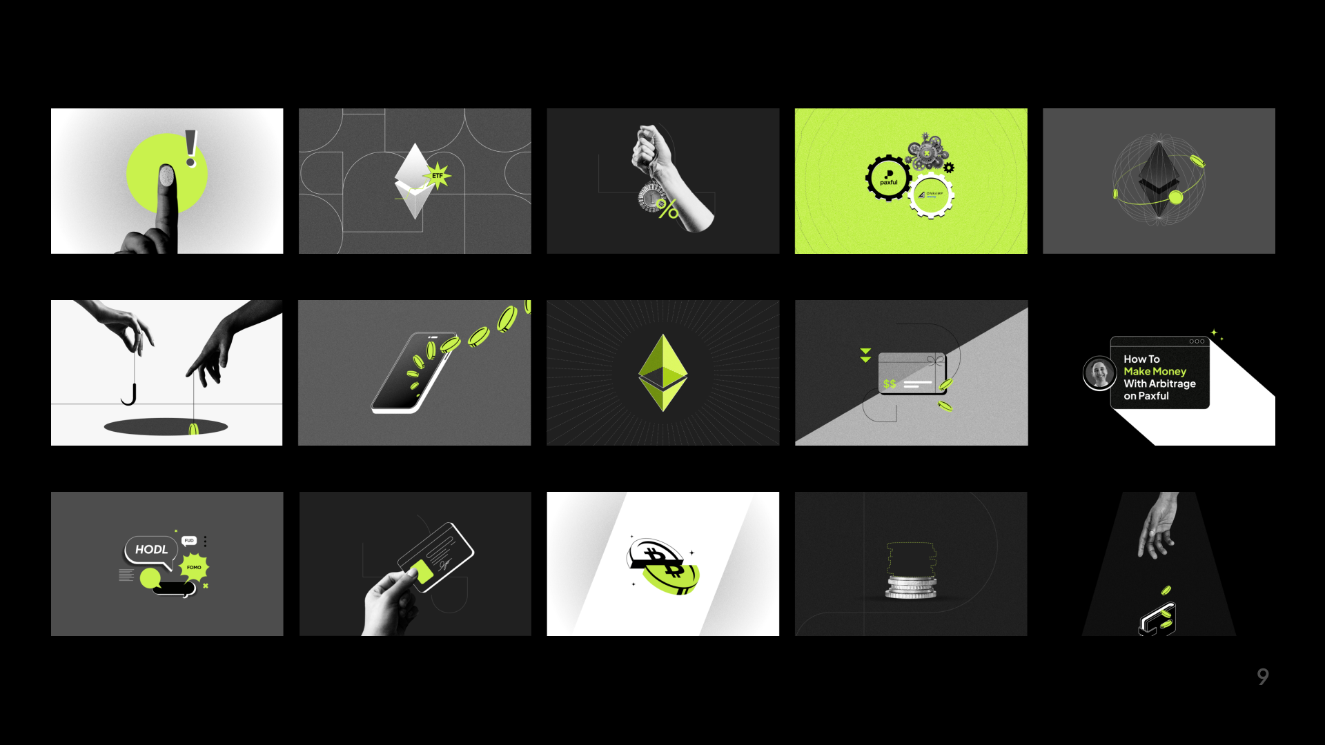
Paxful is the world’s largest peer-to-peer marketplace, connecting over 14 million users across 170 countries. On a mission to simplify the global movement of money, Paxful’s rebrand took inspiration from just that – using simple shapes, a refined color palette and continuous linework to visualize simplified money movement.
Behance link here
Brand Guidelines
The Paxful logo features a custom-designed “P” combining simplicity with innovation. The continuous linework represents movement and connection, echoing Paxful’s mission of simplified money movement.


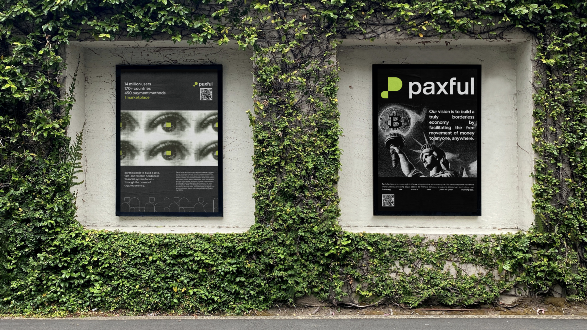
Paxful in the Wild
OOH, marketing and merch


Product Redesign
Web and mobile app redesign


